Designing an online stock trading website for one of the first discount brokers in India. Keep in mind that, we have to help all the needs of a proficient trader as well as the newbies.

The Zerodha platform was struggling with a large amount of bounce rate. Even though the SEO played a vital role to bring leads to the website the number of people quitting was extremely large. 95% of the users quit before signing up with Zerodha. No credibility and trust and super slow website were the primary reasons.

Create a unique, lightweight, and user-friendly website. Build credibility among the people who are already into traditional trading. Attract new traders / customers. Increase lead generation. Create a mobile-friendly website
Product strategy design, User experience design, User Interface design.
SketchApp, Adobe XD, Balsamiq, Illustrator, Paper and pen.
In 2013, there were very few online discount brokers available in India. So the first thing we had to focus on was building trust and credibility for the company in the online world.
1. Slow to load
2. Not mobile-friendly
3. Not trustworthy
4. Aesthetically not appealing & Complex
5. No proper information hierarchy
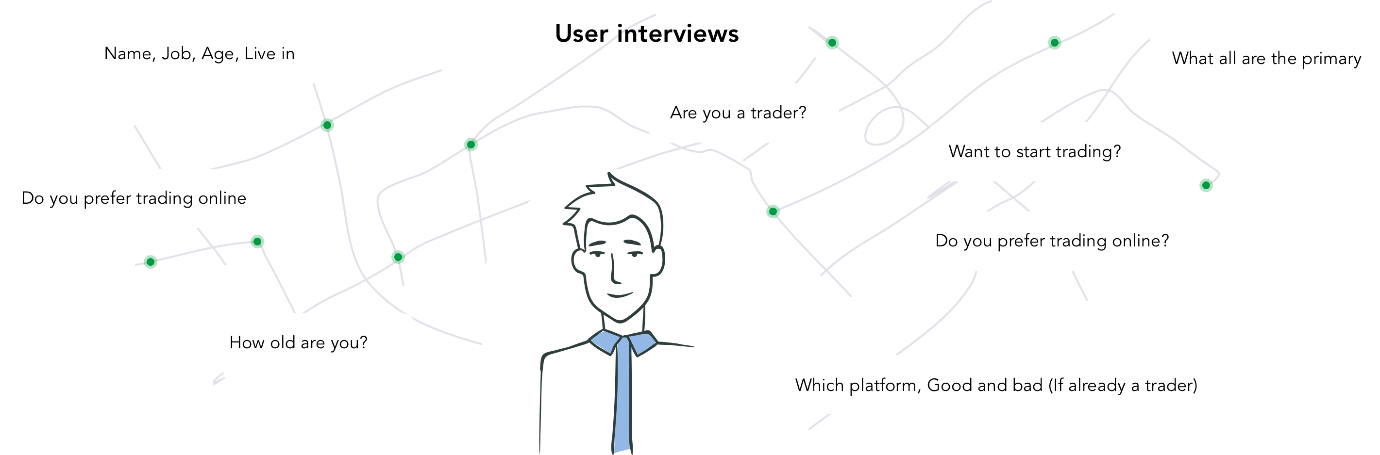
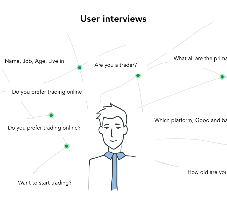
Created a platform to collect feedback from the existing customers of the company. The team reached out to the clients and requested them to share a genuine review about their broker. We got hundreds of responses, and the feedback was extraordinary.


Need to start trading
which is the best credible website
I want to check the profit
I don't want to spend more time on the signup process

Is it safe & free?
When will I use it on mobile?
How much amount should I spend on the brokerage fee?
is zerodha sebi registered?

Worried & Sad
Frustrated
Happy after creating an account
Satisfaction

Search on google
Check with friends
Search on online blogs and quora
Checking different websites
Give the only to someone already into trading
Age: 29
Job: House wife
Priorities: Need an easy to use website. I wanted to access it on mobile. Wanted to invest money so credibility is important.
Pain points: Earlier started an account in another online platform but lost money. Difficult to find a genuine and credible platform.
Age: 36
Job: CEO
Priorities: Need to calculate the brokerage fee. Wanted to know about the new products and news from Zerodha. Mobile friendly.
Pain points: Hard to find the brokerage fee before investing. Since I'm travelling often it would be great to have a mobile-friendly website with a faster loading time.
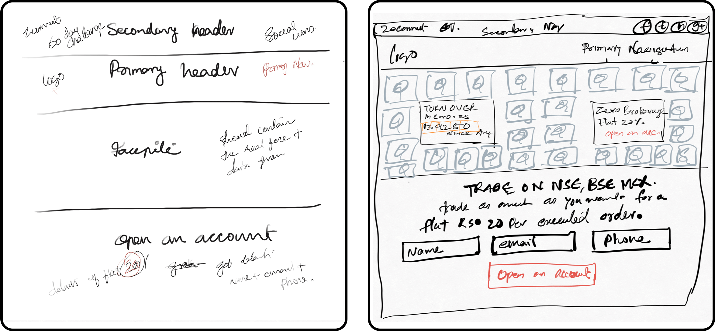
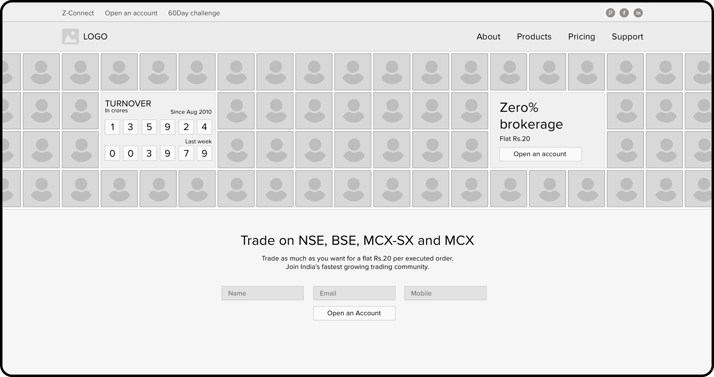
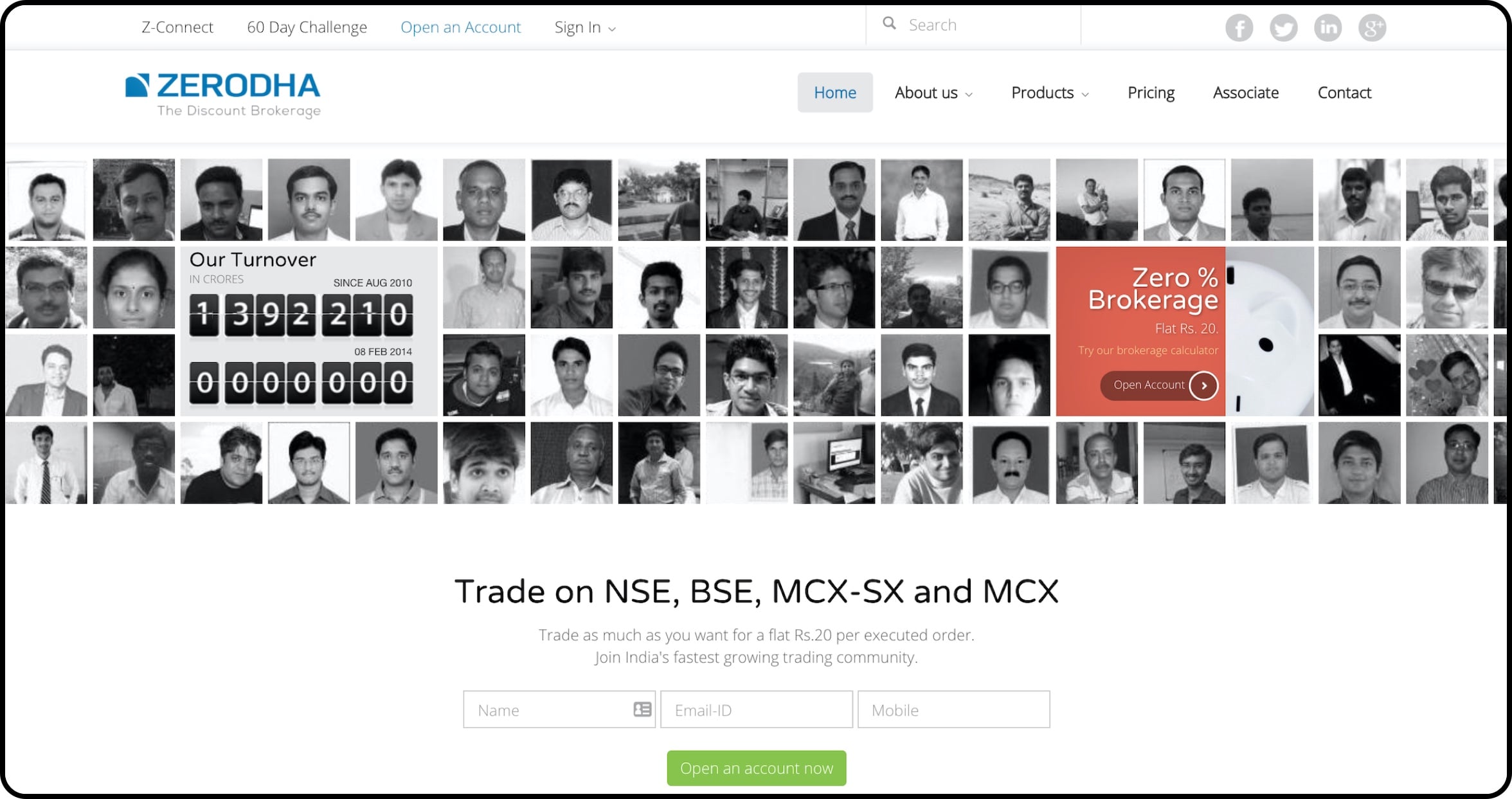
Introduced face pile on the home page. By this approach, we can add as many testimonials on the home page and that too without compromising the design as well as space. The face-pile real-time and dynamically change so that people won't get bored with the static images all the time, The user will not see the same guy and his feedback over and over again. Instead, the users will be greeted with fresh faces and testimonials, whenever they visit the website. Along with this, we promoted the fantastic turnover of the company as a dynamic ticker. So that people can see the growth of the company in realtime.
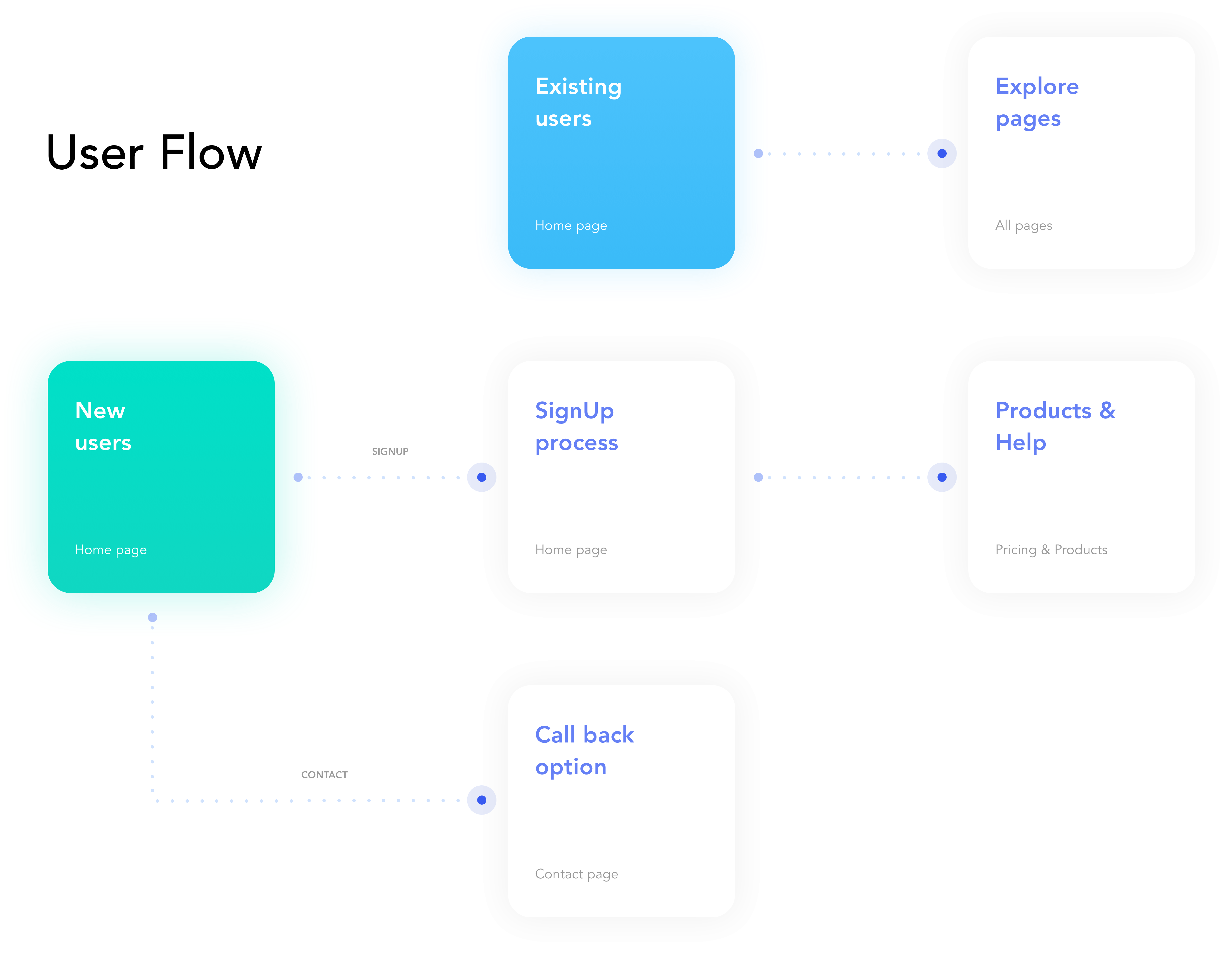
To control bounce rate, we did market surveys, discussed with actual traders, and brainstormed with industry leaders. It gave us an insight into the overwhelming questionnaires in the account opening forms. People were losing out on their attention span, and nobody wanted to fill forms online or offline. While the account opening form should be placed strategically for better visibility, it demanded minimal input fields and maximum autofill area to make the system do the heavy lifting for the user.
We redesigned the account opening form with just three fields to fill and placed it at the top of the page. Anybody could signup in less than 10 minutes, and Zerodha would contact them. This one thing changed the whole lead conversion statistics, and the results were outstanding.
Designing the brokerage calculator, first of its kind in Fintech. More than the static screens to feed the users with relevant information, we also built handy tools such as the brokerage calculator. Designed a comprehensive brokerage calculator to advise users on brokerage, STT, tax, and much more they had to pay on all their trades across NSE, BSE, MCX, and MCX-SX.
The strategy helped Zerodha to build credibility and trust in their existing customers as well as prospective customers. Which results in more than 70% of new account openings. Reduced the bounce rate drastically on the release of the new website.
